Color

My Paint Palette

As an interior designer, each day I am fully immersed in design and get to experience all the different aspects, even the “other side” of interior design that proves my work is not as glamorous as it may seem! From hands on involvement in renovations to painting, I am there each step of the way. Coordinating all the moving parts is a room can be challenging, but is ultimately why I love my job. When designing a room, I many times start with the paint color.

#1 What Paint Color Is Right For Your Space?

One of the things I try and figure out first when designing a space, is the paint tone – tan, gray, warmer hues, a combination?

I have a selection of favorite colors from Benjamin Moore that are my go to colors to present to my clients.

Typically, I like to pick a couple colors to use throughout the entire home, rather than having a different color in each space.

#2 Colors that are good for different rooms/homes and how to design with them

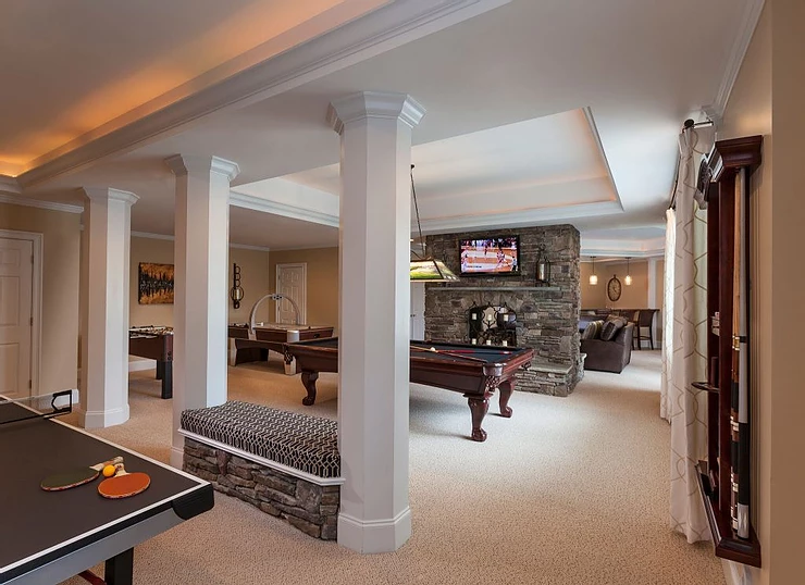
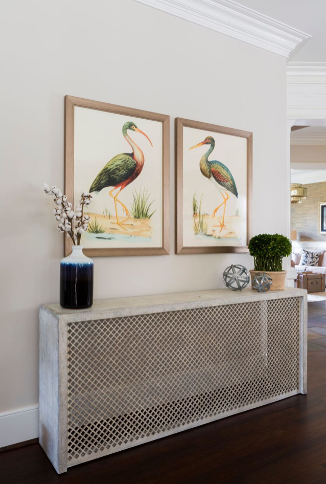
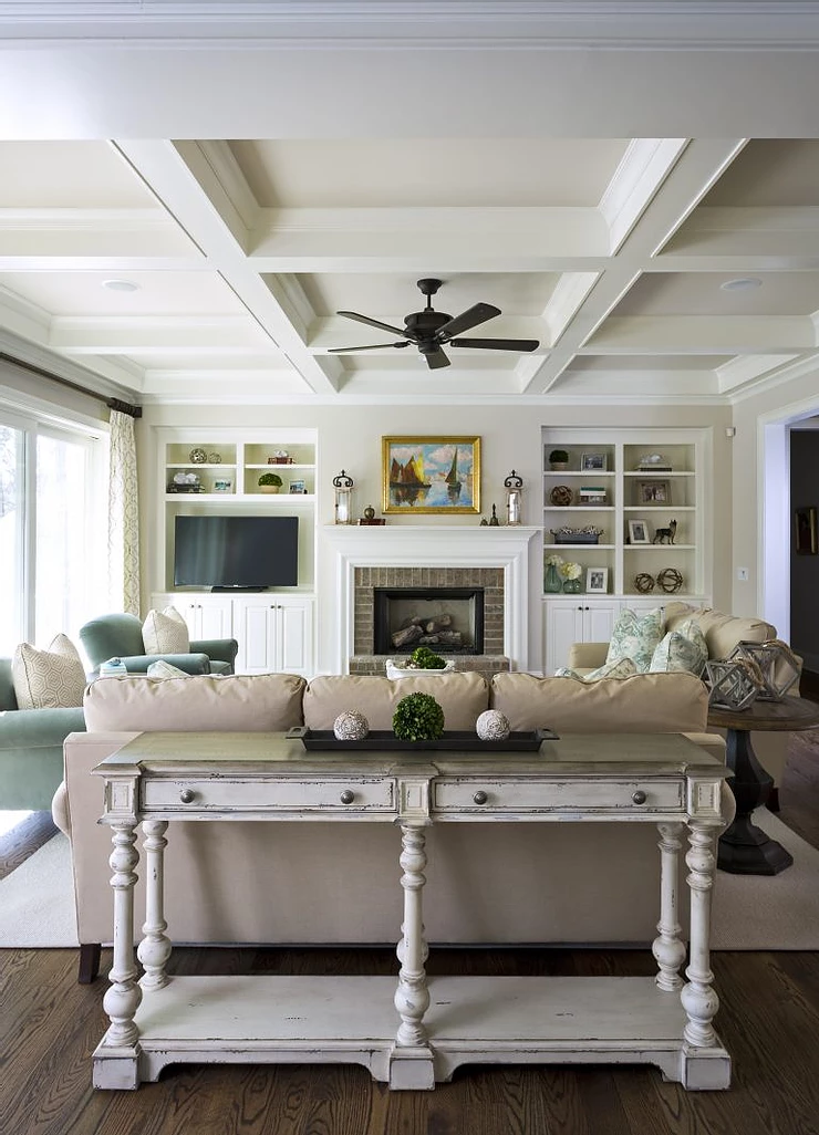
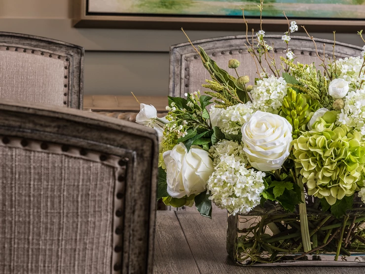
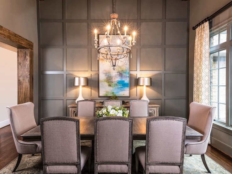
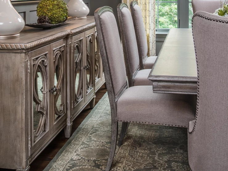
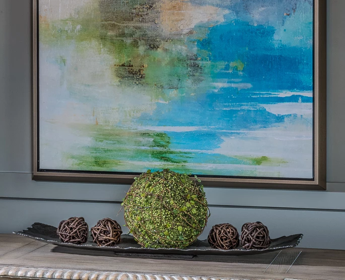
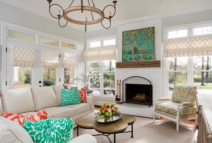
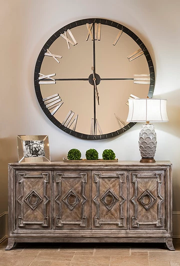
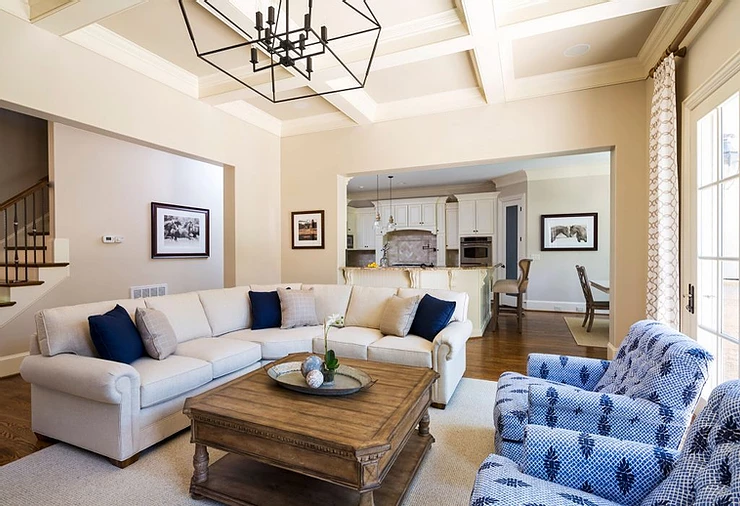
Classic Gray: This color is great to use as a neutral throughout the main areas of your home! Here, we painted the main living room, kitchen, and hallways in Classic Gray. The color is light and perfectly accentuates the blues in the room!

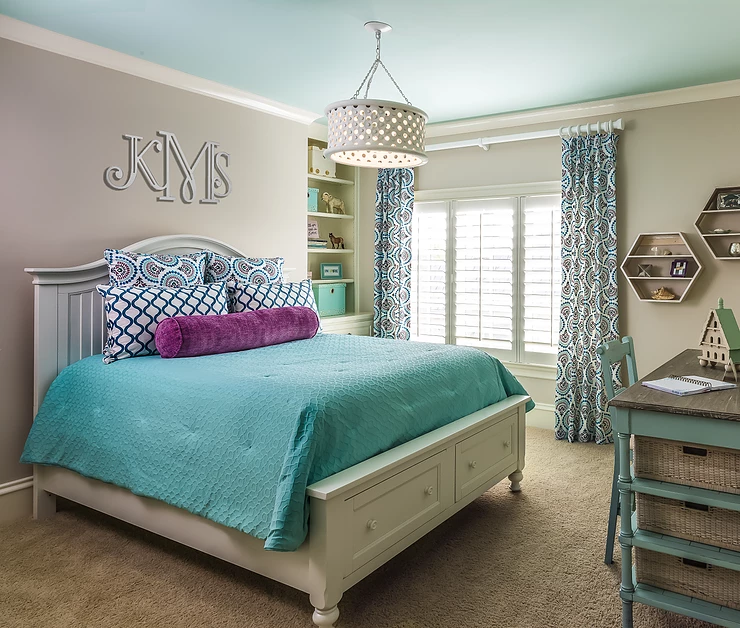
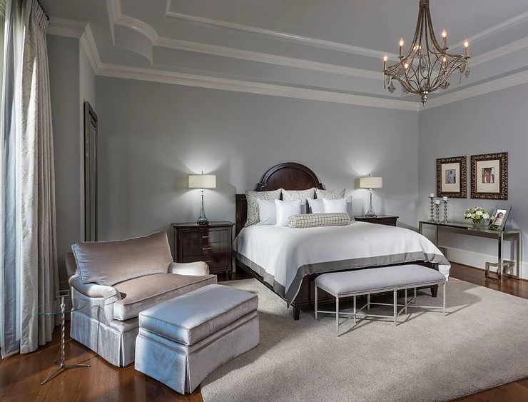
Alaskan Huskey: One of my absolute favorite to use in a bedroom because it is soft and calming, but adds a layer of depth to the walls! The beams were painted white to create an offset with the trim.

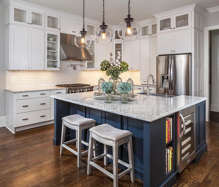
Van Desuen Blue: Used as a pop of color on the island to create excitement and to stray from all white cabinetry! Here with the bold island, I chose to keep the rest of the design simple. 

#3 My Custom Color

I am thrilled to announce that Benjamin Moore Magnolia Paint Company gave me the opportunity to mix up my very own custom paint color – “Makloud!”

There are so many paint colors out there, but I have always thought about taking that a step further and creating my perfect shade. So, I took my favorite neutral Classic Gray and mixed it with Alaskan Huskey.

The result: my perfect shade of gray! An exciting neutral that combines gray with a slight blue hue! The versatility allows it to be used in any area of the home, and it really stands out against the white trim.

Stay tuned for more custom colors to come!

Kids Spaces

Tips For Designing A Teen Space

If you’re like me and are designing with your children in mind, the transition can sometimes be difficult when switching from childhood décor to a teen space. Figuring out this balance can be tricky, but do not let it overwhelm you – try to incorporate your teen’s personal style and you will have a space where they actually want to hang out!

#1 Keep In Mind The End Use For The Space

An important aspect in any home with teens is a designated “hangout space.”

Having the design flow with the rest of your house can be important, but consider asking your kids for their input – this is a fun project to work on together because you want to make sure the space appeals to them.

“Keeping all of this in mind, you will be able to create a dream hangout space where your kids and their friends will want to hang out, while you are still able to keep an eye on them!”

#2 Use High-Performance Fabrics

Inevitably things will spill and messes will be made, so I suggest using high-performance fabrics that will withstand all elements, including messy teens!

#3 Think Fun & Games

Remember, this is the one area in your home that is meant to be more laid back and casual.

As a mom, I’ve sure we’ve all heard “There’s nothing to do here, I’m bored” – take this opportunity to think about endless activities to keep your kids busy – a large screen for movies, gaming tables, board games, video games, arts/crafts, and be sure to include enough seating/space for when their friends come over.

I recently shared these tips on WBTV and you can watch the full segment here!

http://www.wbtv.com/clip/14288479/designing-a-space-for-teens

How to

How To: Set Up Your Home Office To Be Your Most Productive Self

I know setting up a space to work from home can sometimes be a daunting task. Easily met with distractions and pulled in different directions from family responsibilities, to household chores, sometimes getting your job done at home is more difficult than you think.

For me, design is an easy and simple solution to solve this problem. When faced with a design project, creating a home office is always fun.

Before I start designing, I like to take a step back and think about the purpose of the room. I always ask myself, and my client these questions:

Will you be working from the home office every day?

Will the office be used for meetings with clients?

Or, will the space be a mixture of both?

If you are planning to work from home everyday, productivity is key. Zoning in on the elements that will help you stay on track are most important here. On the other hand, if you plan to meet with clients from home, I tend to think the overall style and design can take a heavier weight in importance.

After figuring out the end use, I tailor these simple steps below for each project to form a design that will fit your personal needs.

If Possible, Find The Quietest Area In The House: One of the luxuries to working from home is a quiet environment. If you have the option, always choose a room with a door so you can shut out household noise to focus better.

“If you are unable to use an entire room in your home as an office, make sure your selected area is dedicated specifically to your work. Making this distinction, helps yield a more positive work ethic.”

Declutter, Declutter, Declutter: This seems obvious, right? Well sometimes desks get so overcrowded that it becomes difficult to sit down and focus. I suggest taking everything off and only bringing back the things you use on a day-to-day basis. If you have built in shelving, this is a great place to artfully display the “clutter” that was originally on your desk.

Lighting: Natural lighting is your best friend and resource. Try positioning your desk near windows to optimize natural lighting. Utilizing desk and floor lamps to maximize lighting with a soft glow, will create a well lit space for work.

Comfort is Key: Now this element can be tricky. Sitting on a couch all day might be so comfortable that you are unable to get work done. This is where you can get creative, a stylish and plush desk chair will be comfortable to sit in all day and can double as a statement piece.

I know a lot of debate is still circulating on whether or not employees are more productive from a home or work office, yet I can’t help but believe that a well thought out and designed home office helps increase productivity!

Design Tips

Solving The Mystery Of What Size And Where To Hang Artwork And Mirrors


You might call me crazy, but in the midst of spring cleaning, I always find that this is the best time to refresh your home with a little artwork.

Believe it or not, there is actually an art to hanging artwork and mirrors; although, it is not difficult to figure out if you follow these few simple steps!

“I am a strong believer that less can sometimes be more. Instead of hanging something on every available wall, I typically choose one or two pieces that will stand out as a strong focal point in the room and enhance the overall design.”

First, think about the size of your space in contrast to the size of your artwork. A good rule to follow is for it to be 2/3 the width of the furniture below it.

One of the most common mistakes when hanging artwork and mirrors is that they are hung too high. I know the rule of thumb is typically to hang artwork at eye level, but heights can vary. Follow these tricks to help solve this mystery!

Hanging A Single Piece of Artwork: The center of the piece should be between 56” – 60” from the floor, so it’s on display at eye level. If mounting above a sofa or a piece of large furniture, I suggest leaving about 5” – 9” of space between the top of the furniture and the bottom of the artwork.

Hanging Two Pieces of Artwork: I always recommend leaving between 2” – 3” between each piece to create a nice balance. 

Tip: If you are not sure about the placement of artwork or a mirror and don’t want to nail it in the wall quite yet, try placing it on a table as a test.

At the end of the day, it is your space and you want to make sure what you hang reflects your personal style, and most importantly makes you happy every time you walk by!

Design Tips

My Top Tips for Decorating & Organizing Your Bookshelves

I always love my visits with the team of Charlotte Today and last week I shared my top tips for decorating & organizing bookshelves.


Tip #1 Take it Off

     –Start your bookshelf design by taking everything off.  You will be amazed at how much clutter is actually on your shelves.  Now start adding back keeping these tips in mind.

Tip #2 Keep it Simple – Less is More

     –Add back a few special photos

     –Use pieces that are important to you

     –Use books as fillers and to give you height and balance and to fill larger spaces.

Tip #3  It’s All About Balance & Symmetry – Real and Visual

     –Add balance by using the same item on both sides of a double bookcase or add items that may not be the same but are of comparable sizes and visually are of equal weight.

Tip #4 Add Pops of Color

     –Bring your bookshelves to life by using pops of color that pull your room design together

     –Of course you know I love to add my favorite green boxwoods wherever possible — it adds color all year long

Design Tips

Refreshing Your Space After the Holiday Decorations Come Down

The Christmas holiday is officially behind us, and it’s time to start putting those decorations away and getting your space back to its former glory. All of the pretty wrapping paper is gone and all of the soft twinkling lights are packed away and as much as I love Christmas, I’m usually ready to get back to my everyday decor again.  It’s the perfect time to reassess your home design with fresh eyes.

1. Stop and Take Stock! Take stock of what you love about the room and how you’d like it to ultimately feel.

– Start by adding back one thing at a time. Remember, things to necessarily have to go back where you had them. That’s part of the fun!

– Greenery: You know I’m all about the greenery in my design so when the pine and magnolia come down, consider adding back greenery in preserved boxwoods, faux florals (the good kind) or even cotton in stems or balls.

2. Swap Out Pillows & Artwork: Since you’re already moving holiday decor back up to the attic, use this as a chance to swap out your pillows and artwork. Pillows are an easy and quick change.  You can go from wintery/holiday to fresh and bright in seconds.  Changing your artwork in your main living areas can make a huge impact and breathe life into your space.

“Play around with it and have fun!  And make sure your artwork fits the space.”

3. Make Over your Mantle: I’ll place cotton stems or greenery around the base of my wire-vases. Add color and freshness because that’s probably what you’re craving after the holidays.

4. Your Front Door: I’m all about a wreath year-round! Consider swapping out your holiday wreath for a cotton wreath. Cotton is a gorgeous year-round staple in my home. And remember from last time I was here, 30-36-inches is the perfect sized wreath. Bigger is better!

For more tips on how to refresh your space after the holiday rush, tune into WCNC’s Charlotte Today this morning!

Color

Pantone Color of the Year 2018

At the end of every year, as my girls run around the Christmas tree in excitement for Santa, I am giddy at my computer awaiting the release of the Pantone Color of the Year. This year – drum roll please – it is ultra violet, aka a very deep purple that looks almost regal. Honestly, I think it’s perfect for 2018! Beyond the tie to the royal wedding on the horizon, I see 2018 as a year to mix things up and try something new. What better way to do that than with experimenting with such a beautiful and bold color?!

*Photo courtesy of Pantone

In 2017, the Pantone Color of the Year was greenery. Now y’all know how big of a fan I am of greenery, so needless to say I was 100% on board with incorporating it in every room possible in 2017. This year, with ultra violet, I’m excited to be more strategic about the placement in rooms to come. Not saying it has to be in every design, but I certainly think it’s something to play with for 2018.

As you look to incorporate the Pantone Color of the Year, take a peak at a few of my tips below to see how best to use ultra violet in your home:

1. Use it sparingly – think small doses like vases and lamps 

*Credit to Bradburn Home for the product imagery.

2. Pair with silver and gold accents 

3. Look for art that has ultra violet tones to hang as a focal point in your room(s)

4. Florals are a great way to highlight the Pantone Color of the Year – purple orchids are a wonderful option 

5. For kids, look for patterned bedding and pillows with notes of violet to incorporate into their spaces

Happy designing with the Pantone Color of the Year 2018!

Installations

Spotlight: Silver Fox Lane Dining Room

It’s another new series launch here on my blog! I’m happy to introduce Spotlight, where I share one of my favorite designs with you.

This time, it’s the Silver Fox Lane Dining Room, just in time for all your holiday gatherings.

Who: The homeowners are a young family of four who love to host friends and loved ones, cook and entertain all year long. They have two children and two adorable rescue pups.

What: Foyer, dining room, family room, kitchen, stairwell, laundry and craft/homework room.

When: We worked in a couple of phases. We started with the foyer, dining room and family

room, then tackled the kitchen, stairwell, laundry room and craft/homework room.

Where: Charlotte, NC

Why: Their house was custom built before I met them, and they called me because they needed help furnishing their new home in a way that lived up to the architecture of the house, filling it with pieces that would be the correct scale, design and quality.

Hope you love it!

untitled image

Design Tips

Holiday Decor Tips

I know that all of you are elbow deep right now in preparing your Thanksgiving dinners, but we all know that as soon as the dinner plates are cleaned up, the holiday decorating begins!

So I wanted to share a few tips with you to get you off to a great start.

Start at Your Front Door

The front door sets the tone for the rest of your home.  Make sure your wreath is worthy of your front door!  Staying with my “bigger is better” theory, the best size for a wreath is 30-36-inches.  The general rule is that it should cover at least two-thirds of your door.  Add some lanterns filled with ornaments or lighted trees in your every day pots. The key is to make your front door welcoming and festive.

Use What You Have

I love using decor that I already have and turning it into part of my holiday decorations.  Take a tour of your home and look at things a different way.  Use your glass vessels or trays that are part of your everyday design, and transform them with a sprig of holly or gold dusted pine cones.

Pump Up the Neutrals

So many of us have embraced the more neutral tones in our decor — if you want to tone down the traditional reds and greens and stay with the neutral tones, consider using white or metallics in your holiday decorations.

Don’t Forget Your Guests

The guest room is a room we tend not to go into very often, and sometimes it gets the leftover decor.  So many of us will have family and friends stay with us for the holidays so don’t forget about them!  Add a festive throw and pillows on the bed, a holiday scented candle or diffuser and a welcome basket with cookies, candy, and a book with Christmas stories. You’ll see this cute little Santa keeping guests company when they wash their hands.

Check out more of my tips and tricks on WCNC here

Happy Thanksgiving!

Design Tips

Lauren Loves: Lighting

My philosophy on lighting is simple: lighting to a room is jewelry to an outfit.


When I think about lighting, I always say, bigger is better. Don’t forget, you can always add a dimmer.

“It’s a fact that that 80% of homes are 20% under lit.”

Consider choosing a larger chandelier and don’t forget about multiple sources of lighting like wall sconces, table lamps, and overhead chandeliers.

Press

Trend Spotting with Scoop Charlotte

Hey y’all!

This month I teamed up with Scoop Charlotte and headed to High Point, NC to scout out all the new collections at High Point Market! Check out my guest article on Scoop Charlotte‘s website (and read below here) for the inside “scoop!”

“We came, we saw, we snapped photos—all for you!”

High Point Market, the largest furnishings industry trade show in the world, brings more than 75,000 people to High Point, North Carolina every six months. As an interior designer, I think High Point is better than Christmas. I get to scout out all the new collections, meet with my favorite brands, and curate the best of the best furnishings and accessories for my clients.

With 11.5 million square feet of showspace, my team and I had to be strategic in planning our schedules. We mapped out our journey and off we went. Throughout the days exploring the showrooms, we saw three standout trends you need to know when planning your next room makeover! Hint: they were blue, clear, and patterned all over!

1. Blue (Da ba Dee Da Ba Die) It’s no secret I love using cool tones in my designs. So let me tell you, we hit the jackpot at High Point. We saw accent chairs, credenzas, artwork, and benches all in this fabulous hue. More specifically, shades of deep teal were everywhere. Sherwin Williams has even named their 2018 Color of the Year “Oceanside,” a collision of rich blue with jewel-toned green. This coming year, we’ll definitely be seeing blue—from furniture to accent pieces, it’s one of my favorite ways to brighten up any space.

2. Clearly It’s Popular (*pun intended) Our second scoop we have to share for you is all about lucite. This acrylic-based material is most often seen used as a small accent in accessories and cased goods. Ladies and gents, for 2018 it’s all about using lucite in BIG ways. We spotted barstools, lighting, benches, side tables, mirrors, and even furniture that incorporated lucite in new and creative ways. One of my favorite brands, Gabby Decor, showed some really fun pieces, like the chair I’m sitting in here.

Design Tips

5 Things that Intimidate, but Make a Big Impact

Don’t be afraid to step outside your comfort zone, channel your inner designer to allow your home to make a big statement.

“There’s nothing like going against the grain with your choice of bold colors, wallpaper, prints and artwork.”

Trust me it’s not as scary as it looks! Read on for some of my best tips on how to overcome your fears and make an impact in your home.

1. Add a Pop of Color

So many people are afraid of using color in their home design. With so many color options on the market, there is definitely something out there that will appeal to you and enhance a design. One of the best way to introduce color into your designs is to incorporate it in smaller ways through accent pieces. Keep your big pieces neutral and bring in a splash of color in your pillows, throws and artwork.With bright sunshine and higher temperatures ahead, there is no better room to feature as the room of the month, than this covered outdoor patio! The perfect gathering space for friends and families that is functional, yet beautifully designed with bright pops of color and pattern.

2.Breathe Life into Your Walls

Wallpaper is back and it’s not the nightmare it used to be. If wallpaper makes you nervous, use it in a smaller room that you don’t spend a lot of time in— like a powder room. I guarantee you, it’ll become one of your favorite spaces! Take a chance, I know you’ll love it and will want to continue to use it in your next design projects.

3. Bigger is Better

This is a “biggie” – no pun intended. Increasing the scale and size of lamps, artwork and accessories scares people. The majority of people tend to go way too small—so small that you miss the opportunity to take the room to the next level. Bigger, truly is better. Turn your dull furniture into staple attention grabbers by increasing select pieces, such as using 30-inch tall lamp

4. Mix and Match

There are a few tips and tricks to mixing different prints and patterns. When combining various styles, always make sure there’s a common theme that harmonizes the space. To pull off a consistent look, mix a larger print with a smaller scaled pattern for a stylish geometric effect.

5. Invest In Your Happiness

Splurge on the big pieces—sofas, wood furniture, area rugs, window treatments and lighting. While some pieces are made to fit a specific space, making an investment for more versatile or custom decor will turn your house into a home. The details in quality pieces make a huge difference in the comfort and quality of your space. I’ve learned that if you don’t buy right, you end up buying twice.